Wednesday, March 24, 2010

Custom Ukulele

Today I'll be showing you guys the custom ukulele and business cards I designed for Lauren Fairweather. Lauren asked me to design the front for her ukulele which ended up being a really fun project. She wanted it to be purple and green and gave me the quote "All you need is love" to incorporate into it. I tried to keep it fairly simple since the attention should be on Lauren when she's performing and not entirely on her ukulele. I used transparent purple circles to make an interesting texture for the background and then pumped it up a bit with the green illustrations. Lauren is such a happy and upbeat person and I wanted her ukulele to reflect that.


Lauren then asked me to design some business cards for her, to be ordered from moo.com. I decided to use a lot of the same design elements as in the ukulele, but then I also brought in imagery of other things Lauren likes, such as owls, dice (for 5AG), music notes, and Harry Potter. I tried to make each card as interesting as the rest, with lots of different levels of imagery and transparency, while keeping them all united with the same four-color color scheme. They look great together as a set and really represent Lauren and what she's all about.


Also, I'm thinking of starting a regular question and answer segment, so if you have any questions about graphic design, art schools, youtube, etc. feel free to leave them in the comments as well (or message them to me through email, twitter, owl post...) and I'll answer them as well as I can in an upcoming post!

Typography III Magazine Spread

Hey guys. So, I've kind of failed at updating my blog this month. Sorry about that. It's just that a lot of the work we've been doing in my studio classes has been long-term projects so I haven't had a lot to show you guys so far. I also have a couple older projects that I still need to blog about but I just haven't gotten around to it. So expect several posts over the next couple days.

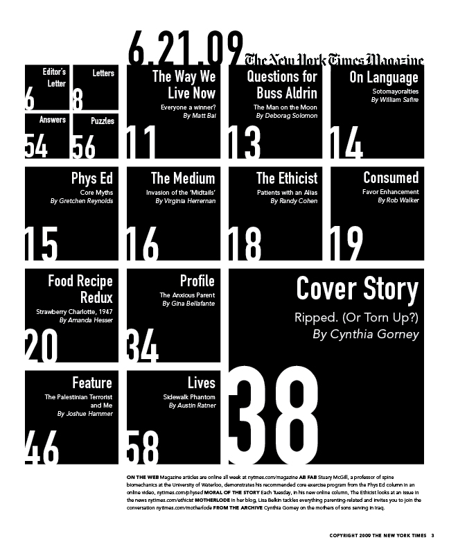
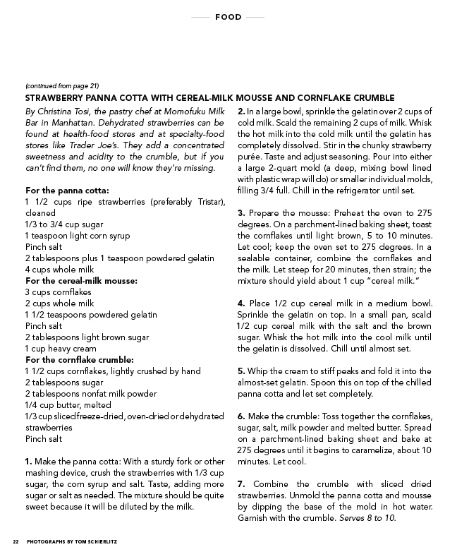
For today, I'll be showing you guys my first project for Typography III. We had to redesign the table of contents and a food section spread for the New York Times Magazine. Here are my solutions (click for larger images):


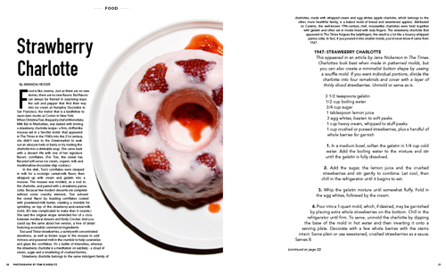
I decided to use Avenir for the body text and Din for the headers. One thing I had to learn was to keep the body text fairly large even though it meant going onto a third page. However, as cute as tiny text is, it's not practical for older readers of the magazine. Also, since the recipes also have to be functional in the kitchen, I made the type size 12, much larger than I would otherwise.

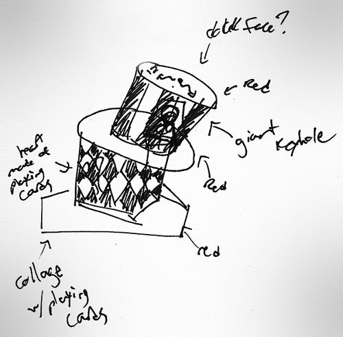
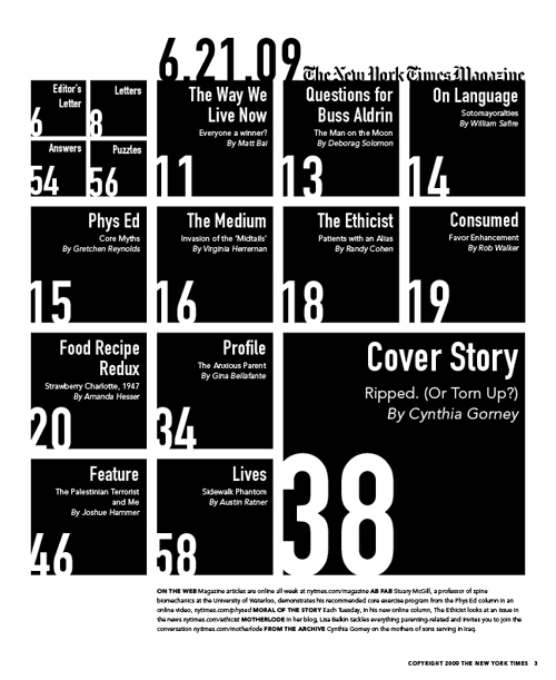
When it came to the table of contents, I had a lot of fun just experimenting with type and the different ways it could be represented.


Above you can see one of my experiments, in which I tried to show each article a different way even though it became completely illegible. In the end, I decided to go with a very obvious grid, with the feature articles getting more space on the page. Also, I tried to make the page numbers very obvious since I always get annoyed when it's hard to tell which page number goes with which article. I chose not to use any imagery in order to put the emphasis on the typographic system I had set up.

The original article can be found online at http://www.nytimes.com/2009/06/21/magazine/21food-t-000.html. Let me know if you have any questions or comments!

Wednesday, March 10, 2010

Alice in Wonderland Hat Version 2

Lately I've really been wanting to make some sort of tutorial video, so I decided to make one showing how to make a smaller version of my Alice in Wonderland hat. It ended up being 2 parts and a nightmare to export and upload, but I think it came out pretty well. Check out the video and photos below and let me know in the comments if you have any questions.


Sunday, March 7, 2010

Alice in Wonderland Hat

So, remember when I said in my last post that I was going to redesigning this blog? Well I never really got around to it during Wintersession and I don't have time to figure it out now, so hopefully it'll get done this summer. In the meantime, I'll continue posting my new work.

On Friday I went to see Alice in Wonderland, and RISD had a "Mad Hatter" contest to see who could make the best hat. I ended up being one of three winners. So that was cool.

When I was making it, I made this sketch and then just jumped right into it.


The hat itself is made of chipboard, and it's all held together with duct tape on the inside. Then I covered it with black and white duct tape and wrapped wire around it. The lower brim is made up of actual playing cards that were glued down and covered with packing tape, and the upper brim is covered with lace printed packing tape. Then, I dirtied it up with black and bronze paint, and decorated the top with a custom bow and the number 12, to reference a clock. Let me know if you have any questions in the comments!