Sunday, May 31, 2009

DFTBA Wallpaper

Today I want to share with you a wallpaper I made yesterday based on the song DFTBA by Hank Green. I think I got the idea on the train to LeakyCon but only felt like fleshing it out and actually making it yesterday.

To make it, I first wrote out DFTBA in the typeface Din (which incidently is the typeface RISD uses in all their publications, so I kept getting reminded of RISD flyers while making it). I decided to use Din because it was bold enough to fit lots of text inside and it was narrow enough to not look oddly proportioned on a wallpaper. Then I laid out all the text for the letter D, using many different typefaces which I don't feel like listing here (if you want to know what a specific one is, feel free to ask). Then I laid out the rest of the letters, keeping the typeface and color consistant for each phrase and trying to keep the size as consistant as I could, though some of them had to be made larger or smaller to get everything to fit.

That's about all there is to it. I may work with it more in the future to give it an actual application, but for now I think it works fine standing alone as a wallpaper. I'd love to hear your thoughts on it!

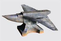
Photo Manipulations

Today I'm going to take a break from graphic design and show you guys some photo manipulations. For a while in high school, I entered contests on www.worth1000.com, and while I usually didn't do very well, I occasionally did alright. For example, this piece got something like 8th place in an advanced contest, which was pretty cool. The contest was to put wings on an object that usually doesn't have them, so I made a flying anvil. This was made in January 2006.


This one was made for a class in high school, in April 2007. I forget exactly what the assignment was, but I decided to manga-ize my face, and put the two sides of my personality on the two sides - the art and creative stuff on one side and the math and organized stuff on the other side (yes, I was kind of a math nerd in high school).


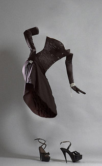
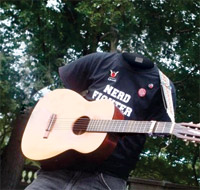
Next are two invisibles. These are some of my favorite manipulations to make, since they combine using the clone tool to obscure part of the photo with using the brush tool to draw in parts of the clothing that need to be there. The first is of some random model, but I'm really happy with it, especially since it was one of the first ones I made, back in December 2005. The other one is of Hank Green of the vlogbrothers, which I made to give him on the Boston Tour de Nerdfighting stop in October 2008.


One last note, I haven't really been getting a lot of comments on this blog. I'm not going to sit here and beg for them, but I really do appreciate what you guys think, so any feedback is welcome :)

Friday, May 29, 2009

Green Day Wallpaper

Today's post takes us back to June 17, 2007. It was right around the time when I was starting to get bored with the blend challenge forum I had been entering contests in, so I decided to make one last wallpaper for there and then call it quits. This wallpaper is kind of the pinnicle of about 3 years of experimenting by myself in Photoshop, before I started RISD and started getting actual design training. While there are definitely things I hate about it now, such as the lack of focal point and the abundance of overly decorative type, I still have a soft spot in my heart for it. I do think I managed to create a pretty nice texture for the photos, and it could be the starting point for a whole promotional campaign (with many major changes, of course). I don't feel like looking up the typefaces, but they were all from dafont.com.

If you guys have any thoughts, please let me know! I recently went through my old hard drive and pulled out some stuff I thought was still fairly decent, so there will be a couple posts coming up with stuff that's 1 or 2 years old. I hope you guys like them; no one has seen most of this stuff in years. I'm kind of nervous showing it, but I don't have much new stuff to post, so hopefully this will suffice.

Without further ado, here is that wallpaper:


(Click to make it bigger)

Thursday, May 28, 2009

Dr. Horrible Wallpaper

I apologize if some of the stuff I'm posting here is now are things you guys have seen before; I really just want to get a record on here of the work I've done recently. I promise you, new work is coming soon!

Today I'm going to talk about the Dr. Horrible wallpaper I made in March and posted a video of on my YouTube channel. It was over spring break and I was being nostaligic looking at old posts of this blending site I used to go on, so I decided to create some fanart for the first time in a long time. It was nice to just go crazy in Photoshop without worrying about a critique in class or having to be sure to put in all the necessary information from some complicated assignment. Overall, it took about 2 hours, and while there are definitely things I could go back and change, I'm still fairly happy with how it came out. The typeface used is AkzidenzGrotesk.

The video:

The wallpaper: Click here

Wednesday, May 27, 2009

Pottercast Poster

The first piece I'm writing about here is one that I just made for fun without any real purpose, so I never really got feedback on it. I was bored one night about a month ago so I decided to make a tour poster for Pottercast, using all the shiny new knowledge I had acquired in my Typography and History of Graphic Design classes. I was inspired by a lecture we had had in History of GD about political posters from the 1800s (including one amazing poster for Lincoln which I am very annoyed I cannot find online). Overall I'm pretty happy with it, though I'm still second-guessing the decorative borders on the sides. If anyone has any comments or suggestions, I'd love to hear them!

The typefaces used are Joanna, Impact, Clarendon, Playbill, and Wingdings.

(Click the image to see it larger.)

Tuesday, May 26, 2009

Welcome to karenkavett / blog

Hey everyone. I'm not exactly sure how to start this blog, so I guess I'll just jump in. The purpose of this blog is to show my artwork. You're probably thinking, Wait, don't you have a website? Why do you need two places, you self-indulgent person? Well the reason is that this is will be a place to show work that isn't professional enough to go on my site (like fanart) and to show work that will eventually go on the site when I update it several months from when I make the piece and I don't want to forget it existed (did you follow all that?).

Of course, in the interest of full-disclosure, I will admit that I have previously attempted to blog and epically failed at it. I started one in 2008 which was abandoned after 3 posts. However, I'm really going to try to keep this one up, and if I begin to lose interest, just poke me (...through the internet) until I update again. Also, I will admit upfront that I am not a very good writer. There is a reason why I went to art school and not liberal art school, and why I will make posters for fun but will procrastinate for 5 hours for a paper that takes 30 minutes to write. So don't be expecting blogging on the awesome level of Maureen Johnson, because that's not happening here.

Anyway, I hope that was a suitable explanation for why I am starting this blog. Expect more posts (with actual art in them) soon.