Sunday, December 27, 2009

Christmas Artstuffs

Apologies for lack of updates on this blog lately. I got so busy finishing final projects that I never got around to posting them here as I finished them. However, I will be updating my site in the next few days so keep an eye out for a very long post soon with information about all the new stuff.

For now, here are some Christmas-themed pieces that probably won't go on my site but that I wanted a record of anyway. First, the 12 Days of Nerdfighter Christmas wallpaper I made for the Project for Awesome 2009. The charity: water campaign is now over and it ended up raising $835, which is just incredible. Thank you to everyone who donated, and enjoy the wallpaper:


Second, I spent a day last week letterpressing Christmas cards, which I then made into wallpapers so even people who I didn't send cards to could enjoy them. Watch the video of my process of making the cards, and then check out the wallpapers:

Wallpaper 1
Wallpaper 2

Thank you so much for reading my blog and I hope you all had very merry Christmases!

Monday, November 30, 2009

"Take Me Home" EP Cover


Here is the cover I just finished (this morning, actually) for Paul (songsfrompaul)'s new EP Take Me Home, which can be downloaded for free at http://tinyurl.com/TakeMeHomeEP. Paul wanted the imagery to feature a man walking away in the rain, and I decided that using watercolors as the medium would compliment his music style well. I went through lots of paper just dripping the watercolors down in different patterns, and then pieced it together in Photoshop. I had some trouble deciding on how to handle the title, since no typeface seemed to match the organic quality of the rest of the image (I tried to get Futura to work, but it just wasn't happening), so I ended up writing it with a calligraphy pen and scanning it in. It was a fun project, and I'm happy to have worked with such a talented musician as Paul.

Monday, November 16, 2009

Simultaneous Contrast!

For Color class, we had to do a project on simultaneous contrast, or the effect that happens when you put different colors next to each other. We had to make a light gray and medium gray look the same by manipulating the background colors, and the same with medium and dark gray. Then we expanded it into monochrome and analogous colors.

I chose to present mine as if it was a toy kids could buy. I made cards where the "background" color swings on top of the colors that are supposed to look the same, and can swing backwards so you get two illusions on each card. I also designed some packaging to bring the whole thing together.

Let me know in the comments if you have any questions!


Wednesday, November 11, 2009

Nature Lab Photography

I should have more graphic design work to show you guys soon (I'm almost done with a color project which should go up next week) but for now here's more photography. The assignment for this week was to photograph a place, so I chose RISD's Nature Lab. If you have any questions, let me know.

They're better in real life where you can actually see the cuts in the paper and they come out from the wall a bit, but this is about as good of a scan I can probably get.


Friday, October 30, 2009

Color Spellbook

For Color class, we had an assignment to make a book with pages that represented each of the primary, secondary, and tertiary colors on both white and black backrounds. Being the nerd that I am, I decided to make it a spellbook based off the spells from Harry Potter. Some were easy, like Lumos and Incendio for yellow, and some were obvious after a little thought, like Levicorpus, a spell made up by Half-Blood Prince, for purple. Some of them I just kind of went off a gut feeling, and I think they all turned out nicely. Below are photos of the actual book and then the digital version of the entire book. It's not lined up exactly right here, but in the actual book the lines flow into each page perfectly. Also, the colors got a bit screwed up in all the changing programs and saving for web, but you get the idea. Enjoy!


Full Book
[LARGE FILE]

Thursday, October 29, 2009

Moaning Myrtles Merch

Now that Lauren's put the new Moaning Myrtles merchandise up for sale, I can reveal that designing it was one of my secret projects. Lauren contacted me at the end of August, and I designed a new shirt, a tote bag, and a frisbee for her to sell at Wrockstock and other wizard rock shows. While designing them, I was really inspired by Nicolas Saunders' work, so definitely go drool over his gorgeous designs after you finish reading this.


For the first shirt, Lauren wanted the quote "Don't worry. You're just as sane as I am." I decided to draw the type in a very informal way and surround it with simple illustrations of things that have to do with Luna. I tried to make it look like a shirt you could just buy in a store, and not necessarily scream wizard rock from every inch of the design.


The tote bag was originally another shirt design, but we decided it was more fit for a bag. I had the idea of using bathroom sign pictograms, but making them specific to Lauren and Nina. I really got to play with iconography, making the lightning bolt guitar strap stand for Lauren and the piano scarf stand for Nina. It's a design that you only fully understand if you really know the Moaning Myrtles, but it's also accessible on a basic level to people who don't know them at all.


The frisbee was very much inspired by Nicolas Saunder's work which I linked to above. I didn't want to directly copy his aesthetic, so I stayed away from the grungy style and instead tried to make it look slightly old-fashioned but in that magical way that the films do so well.

Thanks for reading guys. I'll definitely have more work to show you soon :)

Monday, October 19, 2009

Creepy Business

I took some photos over the weekend that I'm really excited about, so I'm posting them here before I even present them to my class. I set them up by putting playing cards in the sink and getting them damp and then dropping ink on them, and I love how in black and white the ink looks like blood. The hands are from the Peter Petrelli action figure and are now stained grayish from all the ink.


A few more where I'm playing with dripping the devloper onto the paper and bending the paper while shining the light on it:


And because I can't seem to go through a week without photographing something Harry Potter related:


Friday, October 16, 2009

More Photography

I promise I'll have more design-y stuff to show you guys soon, but right now it's all still secret. In the meantime, here's some more analog photography:


I tried something different with the last two. Instead of just putting the whole photo into the tray of developer, I used a paintbrush to drip the developer onto the paper, so that some parts developed more than others. I think they turned out pretty cool, and I'm going to be trying it again in my assignment for next week, so be on the lookout for that :)

Tuesday, October 6, 2009

Analog Photography

If you read the post a couple down from this, you know that I'm taking an analog photography class this semester. The first couple weeks were kind of an epic fail, in which I couldn't figure out how to open the camera, then how to get the film out of the canister, and then how to change the developer so the photos would actually develop properly instead of all gray and gross. I think I've overcome most of those obstacles, and since we finally learned how to englarge photos in the darkroom, I thought I'd show you guys the ones I developed. Let me know if you have any comments or suggestions.


(You can probably tell that I really like using my macro lens.)

Tuesday, September 22, 2009

DFTBA Button

A few weeks ago, Alan Lastufka messaged me on Skype and asked me to design a button for DFTBA Records saying "Imagine me complexly." Seeing as how it was the end of summer and I really wanted to procrastinate from packing, I did it right away, and a few hours later presented him with this design which is now available for purchase on dftba.com.


I don't have all that much to say about it, since it is fairly simple. The typeface I ended up using is ITC Goudy Sans Std Black, which I mostly picked because the A is so beautiful. I played around with adding imagery to the button as well, and I tried to put together a version where the words were sort of sitting in grass, to reference Paper Towns, but it ended up being too complicated of a design for such a small object. I'm not sure if I like how much the "me" stands out, since "complexly" is probably the most imporant word there, but the difference in the number of letters was so great that this ended up being the most aestethically pleasing solution. Please go buy the button pack to support DFTBA Records, and thanks again for reading this blog.

Monday, September 21, 2009

Round-up of Week 1 at RISD

I've concluded with certainty that this semester at RISD is going to be very expensive. And busy. Don't forget busy.

I'm starting my 3rd year here, and I'm taking 3 studio classes and 1 liberal arts class. The required studios for graphic design majors are Making Meaning (which meets twice a week) and Color, and I'm also in a photography elective called Intro to Photo for Non-Majors. The liberal arts class is called Philosophy of Religion.

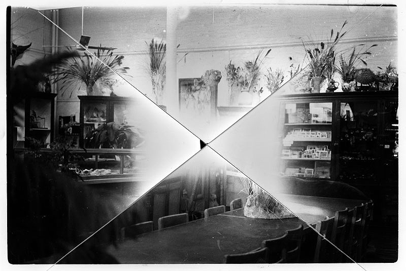
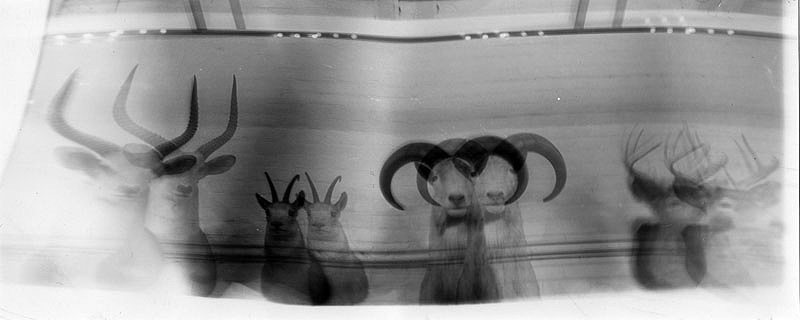
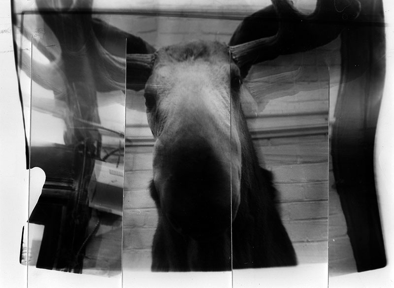
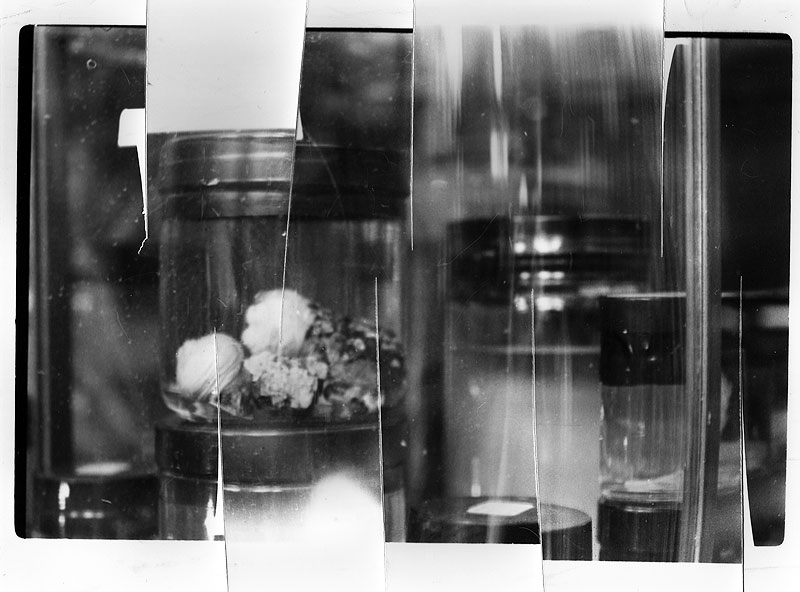
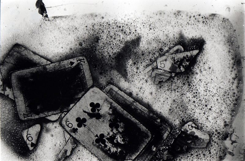
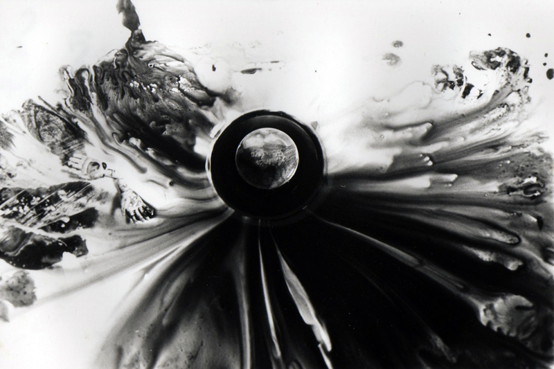
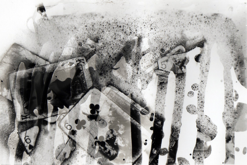
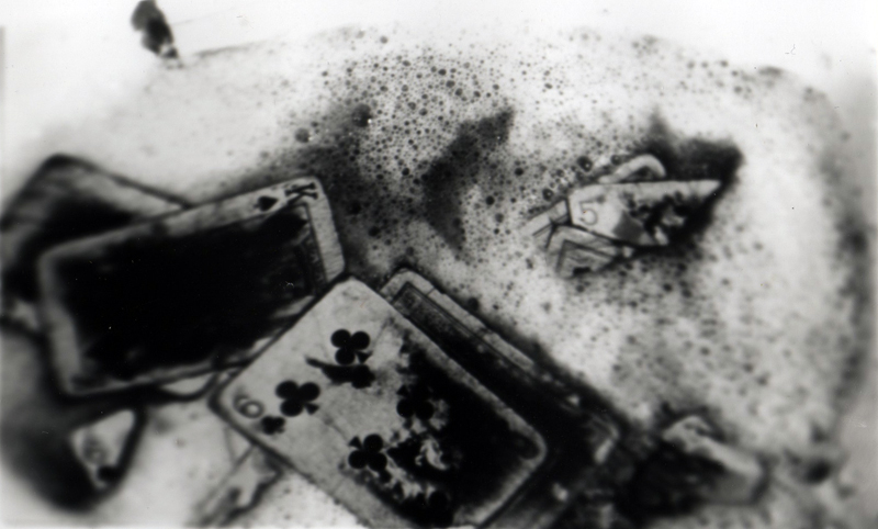
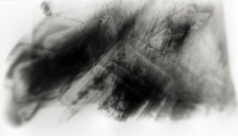
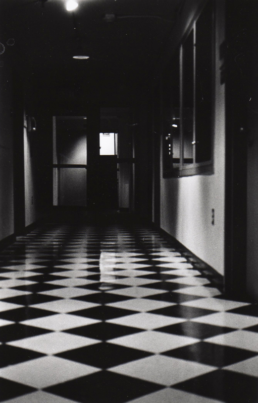
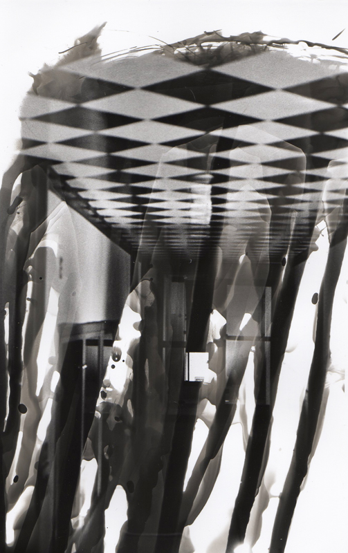
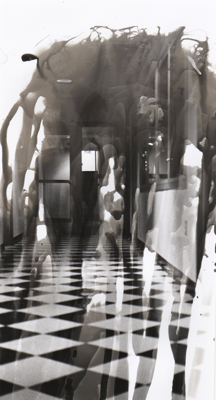
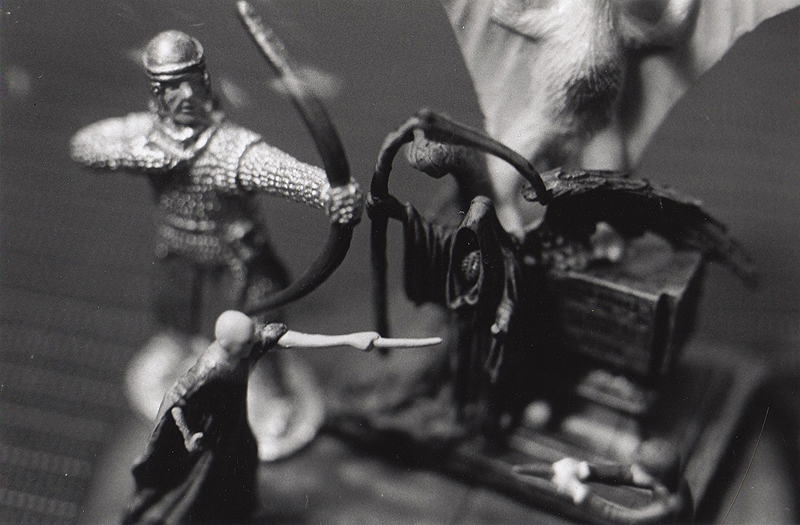
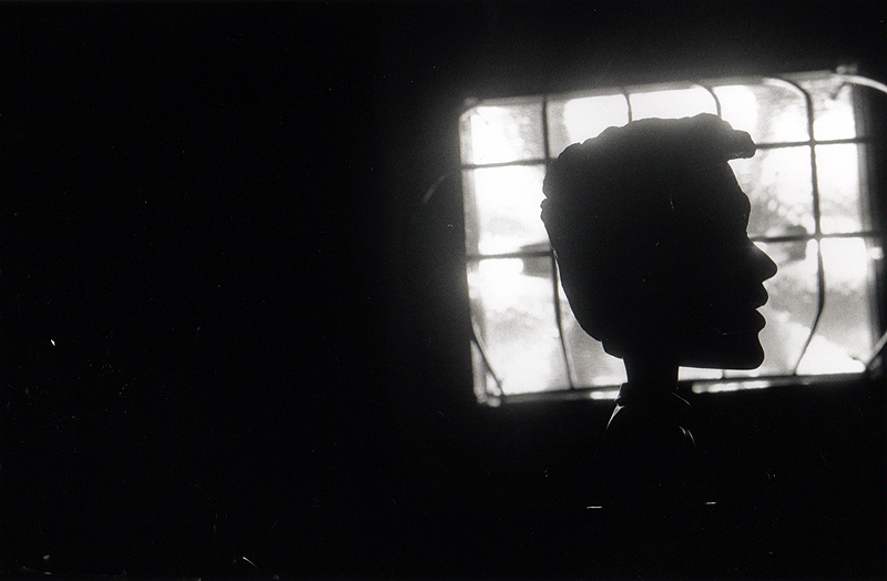
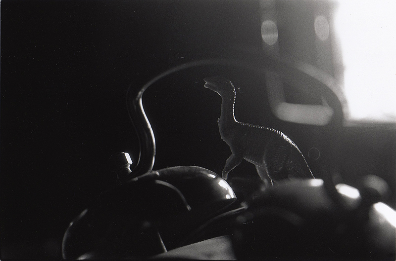
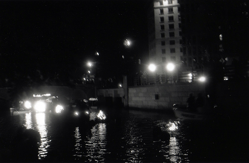
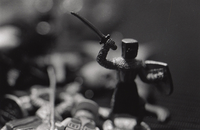
First up, last Wednesday, was Intro to Photo, which is all about analog photography and learning to use the darkroom. The first class was kind of overwhelming, because there's so much to learn, and my teacher didn't exactly tell us everything in order. Also, I've never done photography so manually, where I need to keept track of the light meter, F stop, aperature, etc.

I had a bit of a fail when it came time to do the homework as well. I took the required 2 rolls of film with no problems (though I have no idea if they're going to end up being completely blurry or washed out or whatever), so I thought processing the film wouldn't be very hard either. I mean, I had the handout with the order all the chemicals need to go in, and I've got my shiny new funnels and thermometer. But no. When I went into the tiny completely dark room to move the film from the film canister onto the reels that the chemicals are dumped on, I tried for 30 minutes to crack the top off the canister and could not get it off. So now my film is trapped inside a impenetrable cylinder of plastic and metal, so close and yet so far away. Keep track of my Twitter if you want to know how this saga is going to end, because I'm sure I'll continue to post my annoyances there.

Thursday brought a class I was very glad to see, Making Meaning, which I was mostly looking foward to because it meant the computer was relevant again. We started with a series of lectures by all the different section professors who are teaching Making Meaning, and some of them were absolutely brilliant. They spoke about how images and ideas can stand for other images and ideas, and how the world is really a big mess of symbolism if you just know how to think. Also, one of the teachers had a very entertaining talk in which he discussed what a broom could represent, and he "flew" around the stage on Harry Potter's flying broom and joked about picking up Emma Watson. My professor for the class is an adorable Polish guy who has a very strong accent and a non-completely-complete grasp of the English language, and whose posters he showed us at the beginning of class were abolutely beautiful.

The assignment he have us wasn't quite as beautiful, however. I'm not exactly sure where he's going with it, since right how we're not designing anything, just using words. Basically, we had to come up with a list of 5 people, 5 places, and 5 things, and then for each of the 15, write 5 words that could represent it, going in a progression from most specific to most abstract. For example, one of mine is Coffeehouse > Mugs of Foreign Coffee > Comfy Couches > Books of Poetry > Pastries > Conversation. After that, we need to write a short story using all five people, places, and things. I don't know if I'm doing it exactly right, but I guess we'll find out tomorrow afternoon.

Today was the first Color class. I've been looking foward to this all summer because I honestly don't know much about color. When I need a color palette, I often just steal one from the internet instead of figuring out how to make it myself. However, I wasn't expecting having to buy quite so many materials. The first thing our professor said after taking attendance was that she was handing out the supply list and we should go buy everything before coming back in half an hour. About half the stuff was basic things like rulers and tape, but I had to purchase a lot of gouache (basically expensive, opaque watercolors), some special brushes, a porcelein dish to mix paints in, an 11"x14" sketchpad, and an 11"x14" Bristol pad. Luckily, I've done a few commissions lately that will help to pay for it all so I don't feel so bad about spending so much of my parents' money.

Once we got back to class, we spent the next 3 hours painting color swatches that would represent words like life, love, peace, etc. It wasn't very exciting, but it was useful to get used to using gouache again, since I haven't used it regularly in about 2.5 years. I really couldn't stop myself from thinking the whole time though, "This woule be so much less expensive and so much more precise in Photoshop." I know there are some skills you really do need to learn off the computer, and mixing colors is probably one of them, but still.

So that's been a summary of my first week. I didn't write about my Liberal Arts class since all we've done so far is one reading and buy some textbooks. But I'm excited to learn about religion since right now it just doesn't make any sense to me, at all. Hopefully by the end of the semester I'll at least understand it, even though I doubt my athiest beliefs are going to change ;)

Overall I think I'll learn a lot this semester, even though I'm going to be incredibly busy. Doing 4 studio days is a lot of work, but add on a liberal arts class and everything I do online, and there's basically no free time unless I sacrifice sleeping or eating. Sometimes it's a bit overwhelming, when I think about all the videos and fun graphic design projects I would do if I didn't have homework, and then I remember all the homework I do have and how little time there is in the day. But I think it'll all work out ok, although if you see me tweeting about how stressed I am, now you know why.

If you've managed to read this far, I commend you, and I would offer you a cookie if the nature of the internet didn't prevent such things. Let me know if you have any questions, and I'll probably be posting some new work (both homework and other stuff) onto here soon.

Tuesday, September 15, 2009

New post? What?

Um, hey guys. Remember this? I'm really sorry I haven't posted in a month. It's just that I've been in the middle of several large projects that won't be ready for a while, and all the stuff that's short-term is secret for now. However, since classes are starting again, I'll be much more prolific in the next few months, so hopefully more posts will be coming soon. Anyway, I just wanted to let you guys know that I updated my website with the work I did at my charity: water internship. So, if you want to take a look, go to:
http://karenkavett.com/other.html
http://karenkavett.com/identity.html

Enjoy!

Friday, August 14, 2009

More Twitter Backgrounds

As you saw in a previous post the Twitter Backgrounds I designed for charity: water are online. I made more than the ones you see there though, so I thought I'd share two more which didn't end up making it onto the site. Enjoy :)

Background 1

Background 2


(Sorry for the short posts lately; I'll try to put up a longer one this weekend.)

Wednesday, August 12, 2009

Liane's CD Cover

Back in October, I designed the album art Liane Graham's CD Wit, A Little Bit, which can be seen here. As I was designed it, I took some "behind the scenes" photos, which I never ended up showing anyone, so here they are. In them, you can see how much color correction I had to end up doing, and how low-budget the photoshoot was :P

(Sorry for the lack of thumbnails)

One
Two
Three
Four

Enjoy, and comments are always appreciated!

Saturday, August 8, 2009

Twitter Backgrounds

Yeah, so I kind of failed once again at updating this week. Sorry about that. Anyway, I've been trying to Tweet about this, but Twitter isn't letting me post and it's getting quite annoying. As many of you know, I'm doing an internship at charity: water and one of the things I've been working on is promotional Twitter backgrounds for them. They finally went up for the public yesterday, so go take a look if you're interested :)

Click here!

[Update] Yeah, so I just searched @charitywater on Twitter to see what kind of response they had gotten to the Twitter backgrounds, and TONS of people had retweeted about them and posted that they were using one. That's kind of awesome :)

Saturday, August 1, 2009

New Layout!

Sorry for the lack of updates here, but I've been really busy getting my Etsy store together and finishing the new layout on my site. Eventually I may make a more detailed post talking about the different decisions that went into it, but for now, just enjoy :)

The new karenkavett.com!

And don't forget to check out my Etsy shop!

If anything on the site doesn't work for you, please leave a comment!

Friday, July 24, 2009

Old Layouts

With the redesign of my website being launched soon, I thought I'd write a blog post going through all the past layouts that the site has seen, starting all the back in April 2006 when I first launched it. Also, I've decided to reveal the design I was working on in Summer 2007 but never used, which has never been seen by anyone before. Enjoy!

I first put together my site for my web design class spring semester of junior year of high school. This was my first introduction to HTML, so the design is pretty basic though still functional. Also, I used to call the site Perpetual Motion, instead of just karenkavett.com, so that's where my YouTube username comes from. The photos were all taken by me and the fonts used are Velvet, Georgia, Edition, Ma Sexy, Dance Floor Exit. It was launched on April 20, 2006.


I put together this next layout in August 2006. I just wanted a change, and I also needed room to link to the other site I had just started which had resources like brushes and light stocks to give away. This is also the first time I used the cat with umbrella, which I had just stuck together randomly one day, and then I liked it enough to use it from then on. I traced the vector image of the girl from a photo of one of the Olsen twins, and the fonts used are Arial Narrow, Manzanita, and Tall Paul.


In July 2007, I decided to design the site again, but I didn't really have a clear image of what I was going for. These next two designs were candidates for the main portfolio site and the resources site, but I never ended up using them, because I wanted to expand the site a bit and these didn't really have room to do that.


So, still in the same time frame, I went on to design this layout, which was eventually launched December 31, 2007. This was right around when I started vlogging and when I tried to sell my duct tape stuff for the first time, so I wanted a way to link to all of those different projects easily. I don't really have much to say about the design, other than that it served its purpose for what I needed back then.


That stayed online until December 2008, when I designed what is online now. I decided to get rid of the Manzanita/Tall Paul logo and use a simple Helvetica instead. Also, I decided to change the name of the site from Perpetual Motion to just karenkavett.com. I decided I didn't need such an elaborate home page anymore, so I tried to simplify it a lot and only keep what was really necessary. When I put up this layout, I also decided to take all the fanart off my portfolio and only keep the stuff that was likely to get me a job.


As for what's coming next, you'll have to wait a little while until I finish coding it to find out. But rest assured it's unlike any of what I've done in the past (well, the color scheme is similar to the previous layout but the way it's organized is different).

Thanks so much for reading this, and please leave any comments below!